Restructuring Dunro’s Information Architecture
User Research & Card Sorting
Overview
Dunro is a location‑based social network with more than 2 million active users and over a million local business listings across 300+ categories in the MENA region. Despite this impressive scale, the way people navigated those categories no longer matched their expectations.
Users struggled to find what they needed, and advertisers in niche categories often felt invisible. I set out to understand why engagement was concentrated only in the first few categories and to reimagine how people could explore Dunro’s marketplace more naturally.
I led a research-driven redesign of its category system using analytics, usability testing, and large-scale card sorting to create a human-centered information architecture.
Challenges
Business Challenge
Advertisers in less popular categories struggled to gain visibility, which limited monetization potential for Dunro. Engagement was concentrated in only the top few categories, leaving the long tail underutilized. The static taxonomy also slowed the business from adapting to emerging needs.
Product Challenge
The taxonomy was imported from a governmental dataset back in 2015. It was rigid, overly formal, and often ambiguous. Users faced uncertainty should they search for a pediatrician under Medical or Kids? The grid layout amplified bias by privileging only the top rows.
Research Challenge
There were more than 400 categories to evaluate, making testing complex. We needed to support three languages—Farsi, Turkish, and English—without losing clarity. The timeframe was short, and early usability tests relied on internal participants, which introduced the risk of bias.
Target Users
End users: Everyday Dunro users searching for local businesses. We focused on light to medium users unfamiliar with the old structure, since they surfaced navigation pain points most clearly.
Moderators (Super Users): Local admins adding business data daily. Their operational knowledge highlighted structural gaps and outdated categories.
Paid advertisers (indirectly): Small-to-medium business owners advertising on Dunro. While not direct participants in this round, their visibility needs framed business success criteria.
Sample size & methods:
Analytics: Data from millions of user sessions across mobile, PWA, and web.
Usability tests: ~10 participants (internal + sister company staff unfamiliar with Dunro).
Card sorting: ~50 participants across 4 rounds, sorting 400+ categories.
My Role & Reasoning
I led the project from discovery through delivery.
My reasoning was simple: a taxonomy should reflect how people think, not force them into rigid structures. If people see the same service in different ways, we should offer multiple doors to the same destination. If language feels stiff and bureaucratic, we should make it human and approachable. And if a taxonomy is static, we must make it flexible so it can evolve with the marketplace.
Then I partnered with product designers, content designers and marketing team to explore visual design and prototyping solutions for the new layout and copywriting in Farsi, Turkish, and English with Super Users and customer support to understand the gaps, create a friendly and scannable interface, and worked with engineers to implement a dynamic system that could adapt without requiring a full release cycle.
Process
Analytical Tools
I started with data. Using Power BI, Google Analytics, and Hotjar, I analyzed category performance. The results were clear: the first three or four categories dominated, while everything else was nearly invisible. Users were spending too long on the menu.
Qualitative Research
Moderators and support staff shared how the taxonomy created friction: outdated categories, missing modern SMB types, and overly formal wording. Their perspective grounded the project in real operational pain points.
Usability Testing
I organized tests with colleagues and acquaintances who had little exposure to Dunro. Watching them navigate surfaced problems that analytics alone couldn’t show: confusing terminology, redundant categories, and misplaced expectations.
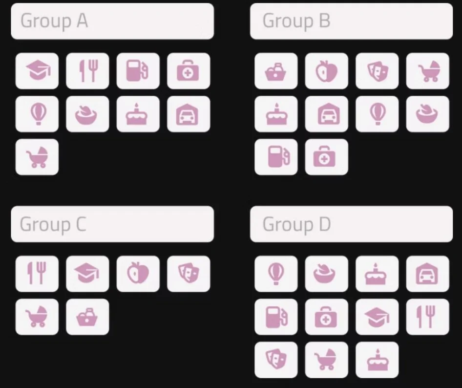
Card Sorting
To uncover how people naturally grouped information, I ran four rounds of open card sorting with Optimal Workshop, each covering about 100 items. The results revealed clearer parent clusters and confirmed the need for duplicates. For instance, pediatricians logically fit under both Health & Care and Kids & Family.
Data Hygiene & Refining the Structure
Based on these insights, I expanded coverage to around 450 categories, introduced new business types, and retired obsolete ones. I rewrote labels in plain, human language and ensured consistency across Farsi, Turkish, and English.

User Interface & Interactions
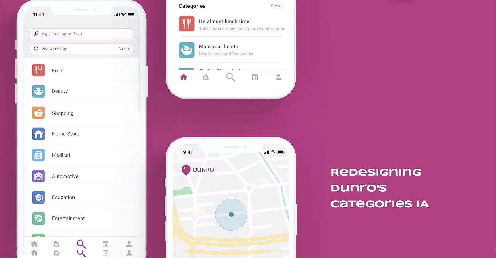
We shifted from a grid to a list, making the experience lighter and encouraging deeper scrolling. Each parent category was paired with a distinct color and icon, chosen with cultural meaning in mind and validated with the marketing team. This gave users quicker recognition and orientation.


Dynamic Category Menu
Finally, I partnered with engineering to create a dynamic dashboard. Categories, names, and duplicates could now be updated instantly without developer intervention. The taxonomy became a living, adaptable system.

Key Design Decisions
Switching to a list layout reduced cognitive load and balanced engagement across the menu. Allowing duplicates respected the way people think, offering multiple paths to the same service. Replacing formal labels with plain language improved clarity. Adding icons and culturally informed colors made categories easier to distinguish. And the dynamic dashboard gave the system flexibility to evolve with user needs.
Outcomes & Impact
After launch, the results were clear. Time spent on the menu dropped by 20–30%, showing that users were finding categories faster. Scroll depth increased, so categories buried lower in the list finally became visible. Engagement spread more evenly across categories instead of clustering at the top.
Within six months, ad revenue increased, particularly in categories that had previously been neglected. Moderators and support teams also saw smoother workflows and fewer complaints.
Learning
I learned that internal testing is useful but insufficient; large‑scale methods like card sorting are crucial to overcoming bias. Expanding categories brings value, but without governance it risks clutter, so pruning and oversight are essential. Multilingual environments require shared glossaries and review cycles to keep copy aligned and effective.