Dunro - Location-Based City Guide
Redesiging Information Architecture for 1 million business listings
Role
UX Reseacher / Interim PM
Methodology
Card Sorting / IA
Duration
8 Weeks

Overview
Dunro is a location-based social network serving over 2 million users and more than 1 million local business listings across 300+ categories in the MENA region.
This case study documents how I re-architected Dunro’s category system and information architecture after identifying a structural mismatch between user mental models and the platform’s legacy taxonomy.
The redesign simplified navigation, improved category discoverability, and unlocked engagement and revenue in historically underperforming categories—directly benefiting both users and paid advertisers.
The Challenge
Dunro’s category structure had remained unchanged since its initial launch. It was originally sourced from an open governmental dataset, optimized for administrative completeness rather than user behavior.
As a result, the system suffered from three structural issues:
First, categories did not reflect how users actually think. For example, users searching for pediatric doctors were split between browsing under Medical and Kids. The taxonomy forced users to guess rather than recognize.
Second, category labels were formal and bureaucratic, increasing cognitive load and slowing decision-making.
Third, category placement directly affected visibility. Categories positioned lower in the menu received significantly less engagement. This was not a demand issue—it was a discoverability problem. Paid advertisers in these categories saw reduced exposure and weaker performance simply due to where they appeared in the hierarchy.
This combination created friction for users and revenue leakage for the business.
My Role
As the UX Strategist, I owned the problem end-to-end. I led user research, behavioral analysis, information architecture redesign, Farsi copywriting, visual exploration, and post-launch evaluation. I also partnered closely with engineering and marketing to ensure the system could scale and evolve.
Research & Diagnosis
I began by grounding the problem in evidence.
I analyzed navigation analytics and found a sharp engagement drop-off for categories positioned lower in the menu. Ad performance data mirrored this pattern, confirming that visibility not relevance was driving results.
I then gathered qualitative input from Dunro’s super users and local moderators, who regularly struggled to categorize businesses accurately. Their feedback revealed deep structural inconsistencies and highlighted emerging business types missing from the system.
To validate these insights, I ran rapid usability testing with participants who had limited prior exposure to the app. These sessions exposed confusion around category labels, redundant groupings, and hesitation caused by overly formal language.
Together, the research confirmed that Dunro’s category system was misaligned with user mental models and actively suppressing discovery.
Rebuilding the Information Architecture
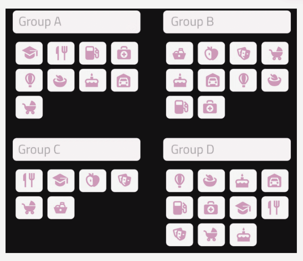
To redesign the taxonomy from the ground up, I conducted open card-sorting studies using Optimal Workshop. Given the scale over 400 items—I split the work into four separate studies to avoid participant fatigue.
The results revealed consistent grouping patterns and surfaced clear opportunities to redefine parent categories. Based on these findings, I introduced a new top-level structure that better matched how users naturally organize places.
Where user mental models diverged, I intentionally designed for flexibility. I introduced duplicate subcategories across multiple parent categories to accommodate different search mindsets. For example, pediatric services appear under both health-focused and family-focused categories, ensuring users can succeed regardless of how they approach the task.
This decision eliminated guesswork and reduced dead-ends in navigation.

Refining the Category System
With the new structure defined, I audited the full category list.
I added new categories to reflect emerging business types and removed or merged outdated ones. The final system expanded to over 450 categories, with clearer s
cope and better coverage.
I also rewrote nearly every category label in plain, conversational Farsi, replacing formal governmental language with terminology users actually use. Each label was optimized for clarity, brevity, and predictability—so users could confidently select a category without second-guessing.
The result was a taxonomy that felt intuitive rather than instructional.
Layout, Visual Design, and Interaction
Structural change alone was not enough. The UI needed to support discoverability.
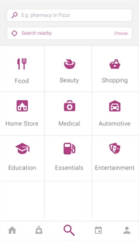
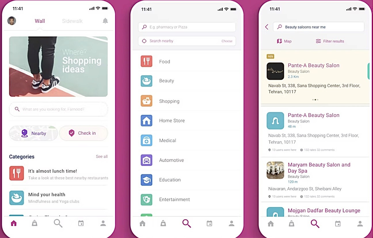
I replaced the grid-based category menu with a single-column list, allowing more categories to remain visible at once and encouraging natural scrolling. This reduced cognitive load and increased exploration.
To improve scanability, I assigned each parent category a distinct icon and color system. These visual cues created instant differentiation and reinforced recognition across the app. Category colors carried through to inner screens and business pages, strengthening visual continuity.
Color choices were informed by cultural context, psychological associations, and validated in collaboration with marketing design.

Enabling Long-Term Flexibility
Previously, Dunro’s category system was static and costly to change. I proposed and helped define a dynamic category management system, enabling internal teams to update the taxonomy without engineering intervention.
This dashboard allows rapid iteration, experimentation, and responsiveness to user feedback—ensuring the information architecture can evolve alongside the platform.
Outcomes
The redesigned system delivered measurable results:
Engagement became significantly more balanced across categories. Previously overlooked sections saw substantial increases in traffic.
Average time spent on the category menu dropped by 30%, indicating users were finding what they needed faster.
Scroll depth increased, confirming improved visibility for lower-ranked categories.
Six months post-launch, paid advertisement revenue increased—driven primarily by improved exposure and performance in historically underutilized categories.
Impact
This project demonstrated that information architecture is not just a usability concern it is a growth lever.
By aligning structure with user behavior, I improved discoverability, reduced friction, and unlocked latent business value. The new system continues to support both user needs and monetization goals, while remaining flexible enough to scale with Dunro’s future.
Refining the Category System
With the new structure defined, I audited the full category list.
I added new categories to reflect emerging business types and removed or merged outdated ones. The final system expanded to over 450 categories, with clearer s
cope and better coverage.
I also rewrote nearly every category label in plain, conversational Farsi, replacing formal governmental language with terminology users actually use. Each label was optimized for clarity, brevity, and predictability—so users could confidently select a category without second-guessing.
The result was a taxonomy that felt intuitive rather than instructional.
Layout, Visual Design, and Interaction
Structural change alone was not enough. The UI needed to support discoverability.
I replaced the grid-based category menu with a single-column list, allowing more categories to remain visible at once and encouraging natural scrolling. This reduced cognitive load and increased exploration.
To improve scanability, I assigned each parent category a distinct icon and color system. These visual cues created instant differentiation and reinforced recognition across the app. Category colors carried through to inner screens and business pages, strengthening visual continuity.
Color choices were informed by cultural context, psychological associations, and validated in collaboration with marketing design.
Enabling Long-Term Flexibility
Previously, Dunro’s category system was static and costly to change. I proposed and helped define a dynamic category management system, enabling internal teams to update the taxonomy without engineering intervention.
This dashboard allows rapid iteration, experimentation, and responsiveness to user feedback—ensuring the information architecture can evolve alongside the platform.
Outcomes
The redesigned system delivered measurable results:
Engagement became significantly more balanced across categories. Previously overlooked sections saw substantial increases in traffic.
Average time spent on the category menu dropped by 30%, indicating users were finding what they needed faster.
Scroll depth increased, confirming improved visibility for lower-ranked categories.
Six months post-launch, paid advertisement revenue increased—driven primarily by improved exposure and performance in historically underutilized categories.
Impact
This project demonstrated that information architecture is not just a usability concern it is a growth lever.
By aligning structure with user behavior, I improved discoverability, reduced friction, and unlocked latent business value. The new system continues to support both user needs and monetization goals, while remaining flexible enough to scale with Dunro’s future.
Other projects


Interested in connecting?
Let’s talk projects, collaborations, or anything design!
Interested in connecting?
Let’s talk projects, collaborations, or anything design!
Interested in connecting?
Let’s talk projects, collaborations, or anything design & Research!